Norman Chainsaws
I should’ve moved to Turin in March of this year, but right at the start of that month the pandemic hit hard here in Italy, so I stayed for a couple of months more at my native home in southern Piedmont countryside.
Just at the start of the lockdown, my mother really wanted a wooden flowerbed to perfect her garden, so my father and I helped her in building that.
At the moment of using the chainsaw though, something pretty embarassing happened: I couldn’t turn it on.
Let me explain: my chainsaw’s power system is controlled by a switch, so the only possible states are turned off and turned on, so when I tried to operate it I checked the switch, I pulled the cord and... nothing happened.
Checked the fuel tank: full
Tried to pull the cord again: nothing
At that point I gave up and asked my father what I was doing wrong, and with a quick glance he had the answer: “The switch is off”.
So he just flipped the switch, pulled the cord and the chainsaw finally started, with me just standing there ashamed of failing such a basic task.
BUT!
As the world class designer Don Norman states in his bestseller “The Design Of Everyday things” (paraphrasing):
If a machine doesn’t work as the user expects you don’t blame the user, you blame the design.
Always citing the book, the connection between my chainsaw and Norman doors is pretty clear.
What are Norman doors?
I’m 100% sure that during your life you’ve pulled a door that was meant to be pushed and vice versa: Don Norman cited so much this example of bad designed doors that the term Norman doors was coined after him.
As he states in the same book I cited above:
The design of the door should indicate how to work it without any need of signs, certainly without any need for trial and error.
Without any need of signs and without any need for trial and error literally hit home here.
Without any need of signs
To be honest, at least bad designed doors try to warn us with some metal plate which says Push or Pull.

The problem with this system though, is that basically 99% of the times the interaction flow is like this one:

Back to the chainsaw, I think that now is the best time to show you a picture of it in order to make you better understand why I got so confused:
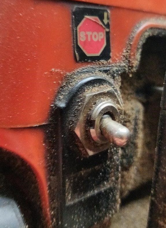
The Stop sign is above the switch, so it’s logical for the user to think that if he/she flips the switch up, the chainsaw should be in the Stop state, but then a minuscule arrow in the topright angle of the sticker says the exact contrary, causing the confusion that I described above.
Not only Norman doors
In this particular an important UX heuristic is also not followed, the first law of locality, which states:
Put the control where it affects change.
This is particularly true in digital design (for example: put the submit button of a newsletter signup form to the right of the email input), but if we translate the same rule from the digital to the physical world the point still stands.
How to fix this flawed design?
Having this simple rule, in order to fix the Norman door problem and respect the law of locality, the designer of the chainsaw should have put the Stop sign UNDER the switch, so that the most natural mental model is followed.